> ## Documentation Index
> Fetch the complete documentation index at: https://moengage-sdk-docs.mintlify.site/llms.txt
> Use this file to discover all available pages before exploring further.
# Cards in iOS
Create targeted or automated App Inbox/NewsFeed messages that can be grouped into various categories, and target your users with different updates or offers that can stay in the Inbox/Feed over a designated period of time. Refer to the [help article](https://help.moengage.com/hc/en-us/articles/360045074752-Create-Cards-Campaign) to learn more about cards.
 # SDK Installation
## Install using Swift Package Manager
MoEngageCards is supported through SPM from SDK version 3.2.0. To integrate use the following GitHub URL link and set the branch as master or version as 4.11.1 and above [https://github.com/moengage/MoEngage-iOS-Cards.git](https://github.com/moengage/MoEngage-iOS-Cards.git)
## Install using CocoaPod
**Information**
CocoaPods is being deprecated. MoEngage recommends using Swift Package Manager for all new integrations. For detailed info on cocoapods, refer to [CocoaPods Integration Guide](/developer-guide/ios-sdk/sdk-integration/basic/integration-through-cocoa-pods).
Integrate the MoEngageCards framework by adding the dependency in the pod file as described in the following image.
```ruby Ruby wrap theme={"theme":{"light":"github-light","dark":"github-dark"}}
pod 'MoEngage-iOS-SDK/Cards',
```
Now run `pod install` to install the framework
## Manual Integration
**Manual Integration**
To integrate the `MoEngageCards` SDK manually to your project follow this [doc](/hc/en-us/articles/4404183451412).
# Displaying AppInbox/Feeds
Once the module is integrated, use the below-provided methods to display the `MoEngageCardsListViewController` with the transition:
```swift Swift lines wrap theme={"theme":{"light":"github-light","dark":"github-dark"}}
// To Push MoEngageCardsListViewController
MoEngageSDKCards.sharedInstance.pushCardsViewController(toNavigationController: self.navigationController!)
// To Present MoEngageCardsListViewController
MoEngageSDKCards.sharedInstance.presentCardsViewController()
```
```objective-c objective-c theme={"theme":{"light":"github-light","dark":"github-dark"}}
// To Push MoEngageCardsListViewController
[[MoEngageSDKCards sharedInstance] pushCardsViewControllerToNavigationController:navigationController withUIConfiguration:nil withCardsViewControllerDelegate:nil forAppID:@"YOUR Workspace ID"];
// To Present MoEngageCardsListViewController
[[MoEngageSDKCards sharedInstance] presentCardsViewControllerWithUIConfiguration:nil withCardsViewControllerDelegate:nil forAppID:@"YOUR Workspace ID"];
```
So as shown above, in the SDK we have provided support for Push and Present transition. In case you want to handle the transition while displaying the Inbox, use the [*getCardsViewController(withUIConfiguration:withCardsViewControllerDelegate:forAppID:withCompletionBlock:)*](https://moengage.github.io/ios-api-reference/Classes/MoEngageSDKCards.html#/c:@M@MoEngageCards@objc\(cs\)MoEngageSDKCards\(im\)getCardsViewControllerWithUIConfiguration:withCardsViewControllerDelegate:forAppID:withCompletionBlock:) method as shown below to obtain the view controller instance:
```swift Swift wrap theme={"theme":{"light":"github-light","dark":"github-dark"}}
MoEngageSDKCards.sharedInstance.getCardsViewController(withUIConfiguration: nil, withCardsViewControllerDelegate: nil, forAppID: "YOUR Workspace ID") { cardsController in
print("fetched CardsController")
}
```
```objective-c Objective C wrap theme={"theme":{"light":"github-light","dark":"github-dark"}}
[[MoEngageSDKCards sharedInstance] getCardsViewControllerWithUIConfiguration:nil withCardsViewControllerDelegate:nil forAppID:@"YOUR Workspace ID" withCompletionBlock:^(MoEngageCardsListViewController * _Nullable) {
self.cardsController = cardsController;
}];
```
# Customizing Inbox UI
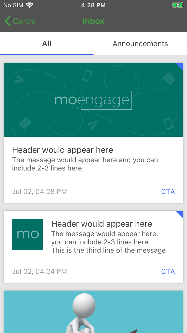
The earlier snapshots indicate what the default UI of the Inbox would look like. But we have also added support for customizing the App Inbox screen according to your App Theme. For customizing the screen make use of [*MoEngageCardsUIConfiguration*](https://moengage.github.io/ios-api-reference/Classes/MoEngageCardsUIConfiguration.html) instance and pass the same in the above-mentioned methods. Refer to the example below:
```swift Swift wrap theme={"theme":{"light":"github-light","dark":"github-dark"}}
let uiConfig = MoEngageCardsUIConfiguration()
// Do customization using uiConfig
// provide the argument while obtaining the MoEngageCardsListViewController instance
// Present Cards View Controller
MoEngageSDKCards.sharedInstance.presentCardsViewController(withUIConfiguration: uiConfig)
// Push Cards View Controller
MoEngageSDKCards.sharedInstance.pushCardsViewController(toNavigationController: self.navigationController!, withUIConfiguration: uiConfig)
// Obtaining the ViewController
MoEngageSDKCards.sharedInstance.getCardsViewController(withUIConfiguration: uiConfig, withCardsViewControllerDelegate: uiConfig, forAppID: "YOUR Workspace ID") { cardsController in
self.cardsController = cardsController
}
```
# SDK Installation
## Install using Swift Package Manager
MoEngageCards is supported through SPM from SDK version 3.2.0. To integrate use the following GitHub URL link and set the branch as master or version as 4.11.1 and above [https://github.com/moengage/MoEngage-iOS-Cards.git](https://github.com/moengage/MoEngage-iOS-Cards.git)
## Install using CocoaPod
**Information**
CocoaPods is being deprecated. MoEngage recommends using Swift Package Manager for all new integrations. For detailed info on cocoapods, refer to [CocoaPods Integration Guide](/developer-guide/ios-sdk/sdk-integration/basic/integration-through-cocoa-pods).
Integrate the MoEngageCards framework by adding the dependency in the pod file as described in the following image.
```ruby Ruby wrap theme={"theme":{"light":"github-light","dark":"github-dark"}}
pod 'MoEngage-iOS-SDK/Cards',
```
Now run `pod install` to install the framework
## Manual Integration
**Manual Integration**
To integrate the `MoEngageCards` SDK manually to your project follow this [doc](/hc/en-us/articles/4404183451412).
# Displaying AppInbox/Feeds
Once the module is integrated, use the below-provided methods to display the `MoEngageCardsListViewController` with the transition:
```swift Swift lines wrap theme={"theme":{"light":"github-light","dark":"github-dark"}}
// To Push MoEngageCardsListViewController
MoEngageSDKCards.sharedInstance.pushCardsViewController(toNavigationController: self.navigationController!)
// To Present MoEngageCardsListViewController
MoEngageSDKCards.sharedInstance.presentCardsViewController()
```
```objective-c objective-c theme={"theme":{"light":"github-light","dark":"github-dark"}}
// To Push MoEngageCardsListViewController
[[MoEngageSDKCards sharedInstance] pushCardsViewControllerToNavigationController:navigationController withUIConfiguration:nil withCardsViewControllerDelegate:nil forAppID:@"YOUR Workspace ID"];
// To Present MoEngageCardsListViewController
[[MoEngageSDKCards sharedInstance] presentCardsViewControllerWithUIConfiguration:nil withCardsViewControllerDelegate:nil forAppID:@"YOUR Workspace ID"];
```
So as shown above, in the SDK we have provided support for Push and Present transition. In case you want to handle the transition while displaying the Inbox, use the [*getCardsViewController(withUIConfiguration:withCardsViewControllerDelegate:forAppID:withCompletionBlock:)*](https://moengage.github.io/ios-api-reference/Classes/MoEngageSDKCards.html#/c:@M@MoEngageCards@objc\(cs\)MoEngageSDKCards\(im\)getCardsViewControllerWithUIConfiguration:withCardsViewControllerDelegate:forAppID:withCompletionBlock:) method as shown below to obtain the view controller instance:
```swift Swift wrap theme={"theme":{"light":"github-light","dark":"github-dark"}}
MoEngageSDKCards.sharedInstance.getCardsViewController(withUIConfiguration: nil, withCardsViewControllerDelegate: nil, forAppID: "YOUR Workspace ID") { cardsController in
print("fetched CardsController")
}
```
```objective-c Objective C wrap theme={"theme":{"light":"github-light","dark":"github-dark"}}
[[MoEngageSDKCards sharedInstance] getCardsViewControllerWithUIConfiguration:nil withCardsViewControllerDelegate:nil forAppID:@"YOUR Workspace ID" withCompletionBlock:^(MoEngageCardsListViewController * _Nullable) {
self.cardsController = cardsController;
}];
```
# Customizing Inbox UI
The earlier snapshots indicate what the default UI of the Inbox would look like. But we have also added support for customizing the App Inbox screen according to your App Theme. For customizing the screen make use of [*MoEngageCardsUIConfiguration*](https://moengage.github.io/ios-api-reference/Classes/MoEngageCardsUIConfiguration.html) instance and pass the same in the above-mentioned methods. Refer to the example below:
```swift Swift wrap theme={"theme":{"light":"github-light","dark":"github-dark"}}
let uiConfig = MoEngageCardsUIConfiguration()
// Do customization using uiConfig
// provide the argument while obtaining the MoEngageCardsListViewController instance
// Present Cards View Controller
MoEngageSDKCards.sharedInstance.presentCardsViewController(withUIConfiguration: uiConfig)
// Push Cards View Controller
MoEngageSDKCards.sharedInstance.pushCardsViewController(toNavigationController: self.navigationController!, withUIConfiguration: uiConfig)
// Obtaining the ViewController
MoEngageSDKCards.sharedInstance.getCardsViewController(withUIConfiguration: uiConfig, withCardsViewControllerDelegate: uiConfig, forAppID: "YOUR Workspace ID") { cardsController in
self.cardsController = cardsController
}
```
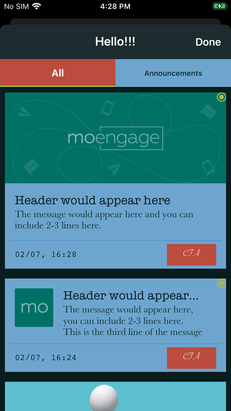 The example of how the UI of Inbox can be completely customized according to your need. Below we have mentioned about what all UI attributes which can be customized using [*MoEngageCardsUIConfiguration*](https://moengage.github.io/ios-api-reference/Classes/MoEngageCardsUIConfiguration.html) instance:
## Customizing Navigation Bar:
Navigation Bar customization includes updating the title, navigation bar color, title color, title font, etc. Create an instance of [*MoEngageCardsNavigationBarStyle*](https://moengage.github.io/ios-api-reference/Classes/MoEngageCardsNavigationBarStyle.html) and set all the attributes as shown below, post that assign the same to your [*MoEngageCardsUIConfiguration*](https://moengage.github.io/ios-api-reference/Classes/MoEngageCardsUIConfiguration.html) instance:
```swift Swift wrap theme={"theme":{"light":"github-light","dark":"github-dark"}}
let uiConfig = MoEngageCardsUIConfiguration()
// Navigation Bar Customizations
let navBarStyle = MoEngageCardsNavigationBarStyle()
navBarStyle.navigationBarColor = UIColor(hex: "#0A1D1F")
navBarStyle.navigationBarTitleFont = UIFont.systemFont(ofSize: 20.0, weight: .semibold)
navBarStyle.navigationBarTitleColor = UIColor(hex: "#FFFFFF")
navBarStyle.navigationBarTintColor = UIColor(hex: "#FFFFFF")
navBarStyle.navigationBarTransluscent = true
uiConfig.navigationBarTitle = "Hello!!!"
uiConfig.navigationBarStyle = navBarStyle
```
## Customizing Category TabBar:
Directly set the attributes of [*MoEngageCardsUIConfiguration*](https://moengage.github.io/ios-api-reference/Classes/MoEngageCardsUIConfiguration.html) instance, you would like to change for the Category Tabs Bar view as shown below:
```swift Swift wrap theme={"theme":{"light":"github-light","dark":"github-dark"}}
let uiConfig = MoEngageCardsUIConfiguration()
// Category Tabs Customizations
uiConfig.categoryTabsContainerBGColor = UIColor(hex: "#6EA6CF")
uiConfig.categoryTabsBGColor = UIColor(hex: "#6EA6CF")
uiConfig.categoryTabsTextColor = UIColor(hex: "#0A1D1F")
uiConfig.categorySelectedTabBGColor = UIColor(hex: "#BB4D3E")
uiConfig.categorySelectedTabTextColor = UIColor(hex: "#FFFFFF")
uiConfig.categorySelectionIndicatorBarColor = UIColor(hex: "#B0BF40")
uiConfig.categoryTabFont = UIFont.systemFont(ofSize: 12.0, weight: .medium)
uiConfig.categorySelectedTabFont = UIFont.systemFont(ofSize: 16.0, weight: .bold)
```
## Customizing Empty Inbox:
In the case of an empty inbox, we provide the option of setting a message and image. By default, the empty inbox will look as described in the following image:
The example of how the UI of Inbox can be completely customized according to your need. Below we have mentioned about what all UI attributes which can be customized using [*MoEngageCardsUIConfiguration*](https://moengage.github.io/ios-api-reference/Classes/MoEngageCardsUIConfiguration.html) instance:
## Customizing Navigation Bar:
Navigation Bar customization includes updating the title, navigation bar color, title color, title font, etc. Create an instance of [*MoEngageCardsNavigationBarStyle*](https://moengage.github.io/ios-api-reference/Classes/MoEngageCardsNavigationBarStyle.html) and set all the attributes as shown below, post that assign the same to your [*MoEngageCardsUIConfiguration*](https://moengage.github.io/ios-api-reference/Classes/MoEngageCardsUIConfiguration.html) instance:
```swift Swift wrap theme={"theme":{"light":"github-light","dark":"github-dark"}}
let uiConfig = MoEngageCardsUIConfiguration()
// Navigation Bar Customizations
let navBarStyle = MoEngageCardsNavigationBarStyle()
navBarStyle.navigationBarColor = UIColor(hex: "#0A1D1F")
navBarStyle.navigationBarTitleFont = UIFont.systemFont(ofSize: 20.0, weight: .semibold)
navBarStyle.navigationBarTitleColor = UIColor(hex: "#FFFFFF")
navBarStyle.navigationBarTintColor = UIColor(hex: "#FFFFFF")
navBarStyle.navigationBarTransluscent = true
uiConfig.navigationBarTitle = "Hello!!!"
uiConfig.navigationBarStyle = navBarStyle
```
## Customizing Category TabBar:
Directly set the attributes of [*MoEngageCardsUIConfiguration*](https://moengage.github.io/ios-api-reference/Classes/MoEngageCardsUIConfiguration.html) instance, you would like to change for the Category Tabs Bar view as shown below:
```swift Swift wrap theme={"theme":{"light":"github-light","dark":"github-dark"}}
let uiConfig = MoEngageCardsUIConfiguration()
// Category Tabs Customizations
uiConfig.categoryTabsContainerBGColor = UIColor(hex: "#6EA6CF")
uiConfig.categoryTabsBGColor = UIColor(hex: "#6EA6CF")
uiConfig.categoryTabsTextColor = UIColor(hex: "#0A1D1F")
uiConfig.categorySelectedTabBGColor = UIColor(hex: "#BB4D3E")
uiConfig.categorySelectedTabTextColor = UIColor(hex: "#FFFFFF")
uiConfig.categorySelectionIndicatorBarColor = UIColor(hex: "#B0BF40")
uiConfig.categoryTabFont = UIFont.systemFont(ofSize: 12.0, weight: .medium)
uiConfig.categorySelectedTabFont = UIFont.systemFont(ofSize: 16.0, weight: .bold)
```
## Customizing Empty Inbox:
In the case of an empty inbox, we provide the option of setting a message and image. By default, the empty inbox will look as described in the following image:
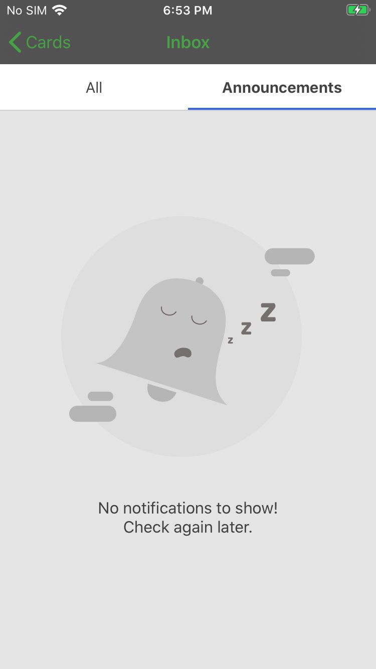 This can again be customized by using the UI configuration instance as shown below:
```swift Swift wrap theme={"theme":{"light":"github-light","dark":"github-dark"}}
let uiConfig = MoEngageCardsUIConfiguration()
// Empty Inbox Customization
uiConfig.emptyInboxText = "No New Messages!!!"
uiConfig.emptyInboxTextColor = UIColor(hex:"#BB4D3E") ?? .white
uiConfig.emptyInboxTextFont = UIFont.systemFont(ofSize: 28.0, weight: .bold)
uiConfig.emptyInboxImage = UIImage(named: "emptyInbox")
```
## Customising Inbox Container:
In case any of the property of `MoEngageCardsListViewController` has to be customized, refer to the below example:
```swift Swift wrap theme={"theme":{"light":"github-light","dark":"github-dark"}}
let uiConfig = MoEngageCardsUIConfiguration()
// Cards Container customization
uiConfig.cardsViewControllerBGColor = UIColor(hex:"#0A1D1F")
uiConfig.cardsTableViewBGColor = UIColor(hex:"#0A1D1F")
uiConfig.pullToRefreshTintColor = UIColor(hex:"#BB4D3E")
// To disable Pull to refresh set it to false, set to true by default
uiConfig.enablePullToRefresh = false
// To change the Delete/Cancel text in Action Sheet
uiConfig.actionSheetDeletionText = "Remove"
uiConfig.actionSheetCancelText = "Never Mind" // New Updates Button Customizations
uiConfig.newUpdatesButtonTitle = "Updates Available!!"
uiConfig.newUpdatesButtonFont = UIFont.systemFont(ofSize: 14.0, weight: .semibold)
uiConfig.newUpdatesButtonBGColor = UIColor(hex:"#BB4D3E")
uiConfig.newUpdatesButtonTextColor = UIColor(hex: "#FFFFFF")
```
**Note**
We have supported pull to refresh in the Inbox, the activity indicator color for the same can be updated as shown above.
## Customizing Card Properties:
We have provided options to customize your Card in the dashboard while creating the campaign, but along with it you can also set the default attribute values so that you don't have to set it every time while creating the campaign, refer to the example below:
```swift Swift wrap theme={"theme":{"light":"github-light","dark":"github-dark"}}
let uiConfig = MoEngageCardsUIConfiguration()
// Cards Default parameters
uiConfig.defaultCardBackgroundColor = UIColor(hex:"#6EA6CF")
// On highlighting the cell
uiConfig.cardSelectionTintColor = UIColor(hex:"#333333")
// Header Label textcolor and font
uiConfig.cardHeaderLabelFont = UIFont.init(name: "AmericanTypewriter", size: 20.0)!
uiConfig.cardHeaderLabelDefaultTextColor = UIColor(hex:"#0A1D1F")
// Message Label textcolor and font
uiConfig.cardMessageLabelFont = UIFont.init(name: "Baskerville", size: 16.0)!
uiConfig.cardMessageLabelDefaultTextColor = UIColor(hex:"#0F2E2A")
// TimeStamp Date Format, Label textcolor and font
uiConfig.timestampDateFormat = "dd/MM, HH:mm"
uiConfig.cardTimestampLabelFont = UIFont.init(name: "Courier", size: 14.0)!
uiConfig.cardTimestampLabelDefaultTextColor = UIColor(hex:"#0F2E2A")
// CTA Button customizations
uiConfig.cardButtonFont = UIFont.init(name: "SavoyeLetPlain", size: 16.0)!
uiConfig.cardButtonDefaultTextColor = UIColor(hex:"#FFFFFF")
uiConfig.cardButtonDefaultBGColor = UIColor(hex:"#BB4D3E")
// Image Customizations
uiConfig.cardImageBackgroundColor = UIColor.clear
uiConfig.cardPlaceholderImage = UIImage(named: "card-placeholder")
// Card Pinned Indicator
uiConfig.cardPinnedImage = UIImage(named: "pinned")
// Unclicked Indicator
// Either Color OR Image NOT Both, If both are set then image will be considered
uiConfig.cardUnclickedIndicatorColor = UIColor(hex:"#7EC247")
uiConfig.cardUnclickedIndicatorImage = UIImage(named: "unclicked")
// Separator
uiConfig.cardSeparatorBackgroundColor = UIColor(red: 10.0/255.0, green: 90.0/255.0, blue: 190.0/255.0, alpha: 0.30)
```
# Getting Cards Count APIs
## Getting New Cards Count:
A Card is considered new if it's not yet seen by the user. To get the number/count of new cards use the [*getNewCardsCount(forAppID:withCompletionBlock:)*](https://moengage.github.io/ios-api-reference/Classes/MoEngageSDKCards.html#/c:@M@MoEngageCards@objc\(cs\)MoEngageSDKCards\(im\)getNewCardsCountForAppID:withCompletionBlock:) method as shown below:
```swift Swift wrap theme={"theme":{"light":"github-light","dark":"github-dark"}}
MoEngageSDKCards.sharedInstance.getNewCardsCount(forAppID: "YOUR Workspace ID") { count, accountMeta in
print("Card count is \(count)")
})
```
## Getting Unclicked Cards Count:
To get the number/count of cards which are not clicked by the user, use the [*getUnclickedCardsCount(forAppID:withCompetionBlock:)*](https://moengage.github.io/ios-api-reference/Classes/MoEngageSDKCards.html#/c:@M@MoEngageCards@objc\(cs\)MoEngageSDKCards\(im\)getUnclickedCardsCountForAppID:withCompletionBlock:) method as shown below:
```swift Swift wrap theme={"theme":{"light":"github-light","dark":"github-dark"}}
MoEngageSDKCards.sharedInstance.getUnclickedCardsCount(forAppID: "YOUR Workspace ID") { count, accountMeta in
print("UnClicked Card count is \(count)")
}
```
# Callbacks using MoEngageCardsDelegate
Use [*MoEngageCardsDelegate*](https://moengage.github.io/ios-api-reference/Protocols/MoEngageCardsDelegate.html) protocol for getting the callbacks from the Cards Module:
```swift Swift wrap theme={"theme":{"light":"github-light","dark":"github-dark"}}
@objc public protocol MoEngageCardsDelegate {
// Called when the Cards data is synced successfully
@objc optional func cardsSyncedSuccessfully(forAccountMeta accountMeta: MoEngageAccountMeta)
}
```
Set [*setCardsDelegate(delegate:forAppID:)*](https://moengage.github.io/ios-api-reference/Classes/MoEngageSDKCards.html#/c:@M@MoEngageCards@objc\(cs\)MoEngageSDKCards\(im\)setCardsDelegateWithDelegate:forAppID:) property of [*MoEngageSDKCards*](https://moengage.github.io/ios-api-reference/Classes/MoEngageSDKCards.html) instance as shown below to get the above callbacks:
```swift Swift wrap theme={"theme":{"light":"github-light","dark":"github-dark"}}
class DelegateClass: MoEngageCardsDelegate {
// ...
MoEngageSDKCards.sharedInstance.setCardsDelegate(delegate: self)// Pass delegate instance
```
# Callbacks using MoEngageCardsViewControllerDelegate
Use `MoEngageCardsViewControllerDelegate` protocol for getting the callbacks from the Cards Module:
```swift Swift wrap theme={"theme":{"light":"github-light","dark":"github-dark"}}
@objc public protocol MoEngageCardsViewControllerDelegate {
// Called when MoEngageCardsListViewController is dismissed after being presented
@objc optional func cardsViewControllerDismissed(forAccountMeta accountMeta: MoEngageAccountMeta)
// Called when a Card is deleted
@objc optional func cardDeleted(withCardInfo card: MoEngageCardCampaign, forAccountMeta accountMeta: MoEngageAccountMeta)
// Called when a Card is clicked by the user
@objc optional func cardClicked(withCardInfo card: MoEngageCardCampaign, andAction action:MoEngageCardAction, forAccountMeta accountMeta: MoEngageAccountMeta) -> Bool
}
```
Set `MoEngageCardsViewControllerDelegate` by passing the delegate as parameter in the below functions:
```swift Swift wrap theme={"theme":{"light":"github-light","dark":"github-dark"}}
class DelegateClass: MoEngageCardsViewControllerDelegate {
// ...
//Pass delegate instance when presenting the controller
MoEngageSDKCards.sharedInstance.presentCardsViewController(withUIConfiguration: nil, withCardsViewControllerDelegate: self)
//Pass delegate instance when pushing the controller
MoEngageSDKCards.sharedInstance.pushCardsViewController(toNavigationController: self.navigationController!, withUIConfiguration: nil, withCardsViewControllerDelegate: self)
//Pass delegate instance when fetching the controller
MoEngageSDKCards.sharedInstance.getCardsViewController(withUIConfiguration: uiConfig, withCardsViewControllerDelegate: uiConfig, forAppID: "YOUR Workspace ID") { cardsController in
}
```
This can again be customized by using the UI configuration instance as shown below:
```swift Swift wrap theme={"theme":{"light":"github-light","dark":"github-dark"}}
let uiConfig = MoEngageCardsUIConfiguration()
// Empty Inbox Customization
uiConfig.emptyInboxText = "No New Messages!!!"
uiConfig.emptyInboxTextColor = UIColor(hex:"#BB4D3E") ?? .white
uiConfig.emptyInboxTextFont = UIFont.systemFont(ofSize: 28.0, weight: .bold)
uiConfig.emptyInboxImage = UIImage(named: "emptyInbox")
```
## Customising Inbox Container:
In case any of the property of `MoEngageCardsListViewController` has to be customized, refer to the below example:
```swift Swift wrap theme={"theme":{"light":"github-light","dark":"github-dark"}}
let uiConfig = MoEngageCardsUIConfiguration()
// Cards Container customization
uiConfig.cardsViewControllerBGColor = UIColor(hex:"#0A1D1F")
uiConfig.cardsTableViewBGColor = UIColor(hex:"#0A1D1F")
uiConfig.pullToRefreshTintColor = UIColor(hex:"#BB4D3E")
// To disable Pull to refresh set it to false, set to true by default
uiConfig.enablePullToRefresh = false
// To change the Delete/Cancel text in Action Sheet
uiConfig.actionSheetDeletionText = "Remove"
uiConfig.actionSheetCancelText = "Never Mind" // New Updates Button Customizations
uiConfig.newUpdatesButtonTitle = "Updates Available!!"
uiConfig.newUpdatesButtonFont = UIFont.systemFont(ofSize: 14.0, weight: .semibold)
uiConfig.newUpdatesButtonBGColor = UIColor(hex:"#BB4D3E")
uiConfig.newUpdatesButtonTextColor = UIColor(hex: "#FFFFFF")
```
**Note**
We have supported pull to refresh in the Inbox, the activity indicator color for the same can be updated as shown above.
## Customizing Card Properties:
We have provided options to customize your Card in the dashboard while creating the campaign, but along with it you can also set the default attribute values so that you don't have to set it every time while creating the campaign, refer to the example below:
```swift Swift wrap theme={"theme":{"light":"github-light","dark":"github-dark"}}
let uiConfig = MoEngageCardsUIConfiguration()
// Cards Default parameters
uiConfig.defaultCardBackgroundColor = UIColor(hex:"#6EA6CF")
// On highlighting the cell
uiConfig.cardSelectionTintColor = UIColor(hex:"#333333")
// Header Label textcolor and font
uiConfig.cardHeaderLabelFont = UIFont.init(name: "AmericanTypewriter", size: 20.0)!
uiConfig.cardHeaderLabelDefaultTextColor = UIColor(hex:"#0A1D1F")
// Message Label textcolor and font
uiConfig.cardMessageLabelFont = UIFont.init(name: "Baskerville", size: 16.0)!
uiConfig.cardMessageLabelDefaultTextColor = UIColor(hex:"#0F2E2A")
// TimeStamp Date Format, Label textcolor and font
uiConfig.timestampDateFormat = "dd/MM, HH:mm"
uiConfig.cardTimestampLabelFont = UIFont.init(name: "Courier", size: 14.0)!
uiConfig.cardTimestampLabelDefaultTextColor = UIColor(hex:"#0F2E2A")
// CTA Button customizations
uiConfig.cardButtonFont = UIFont.init(name: "SavoyeLetPlain", size: 16.0)!
uiConfig.cardButtonDefaultTextColor = UIColor(hex:"#FFFFFF")
uiConfig.cardButtonDefaultBGColor = UIColor(hex:"#BB4D3E")
// Image Customizations
uiConfig.cardImageBackgroundColor = UIColor.clear
uiConfig.cardPlaceholderImage = UIImage(named: "card-placeholder")
// Card Pinned Indicator
uiConfig.cardPinnedImage = UIImage(named: "pinned")
// Unclicked Indicator
// Either Color OR Image NOT Both, If both are set then image will be considered
uiConfig.cardUnclickedIndicatorColor = UIColor(hex:"#7EC247")
uiConfig.cardUnclickedIndicatorImage = UIImage(named: "unclicked")
// Separator
uiConfig.cardSeparatorBackgroundColor = UIColor(red: 10.0/255.0, green: 90.0/255.0, blue: 190.0/255.0, alpha: 0.30)
```
# Getting Cards Count APIs
## Getting New Cards Count:
A Card is considered new if it's not yet seen by the user. To get the number/count of new cards use the [*getNewCardsCount(forAppID:withCompletionBlock:)*](https://moengage.github.io/ios-api-reference/Classes/MoEngageSDKCards.html#/c:@M@MoEngageCards@objc\(cs\)MoEngageSDKCards\(im\)getNewCardsCountForAppID:withCompletionBlock:) method as shown below:
```swift Swift wrap theme={"theme":{"light":"github-light","dark":"github-dark"}}
MoEngageSDKCards.sharedInstance.getNewCardsCount(forAppID: "YOUR Workspace ID") { count, accountMeta in
print("Card count is \(count)")
})
```
## Getting Unclicked Cards Count:
To get the number/count of cards which are not clicked by the user, use the [*getUnclickedCardsCount(forAppID:withCompetionBlock:)*](https://moengage.github.io/ios-api-reference/Classes/MoEngageSDKCards.html#/c:@M@MoEngageCards@objc\(cs\)MoEngageSDKCards\(im\)getUnclickedCardsCountForAppID:withCompletionBlock:) method as shown below:
```swift Swift wrap theme={"theme":{"light":"github-light","dark":"github-dark"}}
MoEngageSDKCards.sharedInstance.getUnclickedCardsCount(forAppID: "YOUR Workspace ID") { count, accountMeta in
print("UnClicked Card count is \(count)")
}
```
# Callbacks using MoEngageCardsDelegate
Use [*MoEngageCardsDelegate*](https://moengage.github.io/ios-api-reference/Protocols/MoEngageCardsDelegate.html) protocol for getting the callbacks from the Cards Module:
```swift Swift wrap theme={"theme":{"light":"github-light","dark":"github-dark"}}
@objc public protocol MoEngageCardsDelegate {
// Called when the Cards data is synced successfully
@objc optional func cardsSyncedSuccessfully(forAccountMeta accountMeta: MoEngageAccountMeta)
}
```
Set [*setCardsDelegate(delegate:forAppID:)*](https://moengage.github.io/ios-api-reference/Classes/MoEngageSDKCards.html#/c:@M@MoEngageCards@objc\(cs\)MoEngageSDKCards\(im\)setCardsDelegateWithDelegate:forAppID:) property of [*MoEngageSDKCards*](https://moengage.github.io/ios-api-reference/Classes/MoEngageSDKCards.html) instance as shown below to get the above callbacks:
```swift Swift wrap theme={"theme":{"light":"github-light","dark":"github-dark"}}
class DelegateClass: MoEngageCardsDelegate {
// ...
MoEngageSDKCards.sharedInstance.setCardsDelegate(delegate: self)// Pass delegate instance
```
# Callbacks using MoEngageCardsViewControllerDelegate
Use `MoEngageCardsViewControllerDelegate` protocol for getting the callbacks from the Cards Module:
```swift Swift wrap theme={"theme":{"light":"github-light","dark":"github-dark"}}
@objc public protocol MoEngageCardsViewControllerDelegate {
// Called when MoEngageCardsListViewController is dismissed after being presented
@objc optional func cardsViewControllerDismissed(forAccountMeta accountMeta: MoEngageAccountMeta)
// Called when a Card is deleted
@objc optional func cardDeleted(withCardInfo card: MoEngageCardCampaign, forAccountMeta accountMeta: MoEngageAccountMeta)
// Called when a Card is clicked by the user
@objc optional func cardClicked(withCardInfo card: MoEngageCardCampaign, andAction action:MoEngageCardAction, forAccountMeta accountMeta: MoEngageAccountMeta) -> Bool
}
```
Set `MoEngageCardsViewControllerDelegate` by passing the delegate as parameter in the below functions:
```swift Swift wrap theme={"theme":{"light":"github-light","dark":"github-dark"}}
class DelegateClass: MoEngageCardsViewControllerDelegate {
// ...
//Pass delegate instance when presenting the controller
MoEngageSDKCards.sharedInstance.presentCardsViewController(withUIConfiguration: nil, withCardsViewControllerDelegate: self)
//Pass delegate instance when pushing the controller
MoEngageSDKCards.sharedInstance.pushCardsViewController(toNavigationController: self.navigationController!, withUIConfiguration: nil, withCardsViewControllerDelegate: self)
//Pass delegate instance when fetching the controller
MoEngageSDKCards.sharedInstance.getCardsViewController(withUIConfiguration: uiConfig, withCardsViewControllerDelegate: uiConfig, forAppID: "YOUR Workspace ID") { cardsController in
}
```